
Let's Talk About Non-Metal-Metal (NMM)

A lot of new painters want to jump straight into this advance technique without realising it is built on the foundation of most of the basics along with a couple of intermediate techniques.
The basics being; blending, glazing, layering, colour mixing, contrast, and edge highlighting. The intermediate techniques that help with the advanced ones are: understanding how base coats interact with the paints you put on top, brush control and having a solid understanding of light sources.
I certainly would never discourage anyone from having a go, but if you haven’t quite figured out the above, you are setting yourself up to fail. And then get disheartened and probably get fed up, you know how it goes.
You are after all trying to paint an illusion, a ‘trompe l’oeil’ (deceive the eye). You are trying to make a piece of 3d moulded plastic look like a piece of metal, without using metallic paints (paint which has flecks of actual metal in it).
You also have to remember that metal being metal, reflects a lot of light and its surroundings, but you are wandering into the realms of chrome there and that is a whole other level of NMM. So let’s keep to the basics.
This guide focuses on gold NMM, but the principles are the same for steel NMM. Once you feel comfortable with the basics of NMM then you can start wandering into the sub-levels of the technique, like brushed steel, chrome etc.
I have a set recipe for gold NMM and use certain paints, the main thing to go with if you use other types of paints is just to figure out what kind of gold you want to go with. Mine is pretty neutral but can change depending on the kind of base coat I use and how I mix the paints.
I’m writing this in conjunction with painting the Chang’e model by Clay Cyanide. Her headdress was the perfect opportunity for me to practice NMM gold and I suddenly decided to work more on NMM in the latter half of 2021. I tend to change my focus of techniques throughout the year, in order to constantly challenge my skill level and not stay within my comfort zone.
***
**Let’s just have a quick side-step and talk about base coats**
Because the way we paint with acrylics, often in very thin layers, and depending on the colours and paint we use, the paint can end up being very transparent. Unless you’re using a very pigment dense paint and don’t thin it, it won’t be transparent. But, more often than not the paint tends to be quite transparent. This means that colours from underneath the layers we put on top will show through in some way.
I have two different types of gold on Chang’e’s top half. One is a more warm gold on the trim of her dress and the one on her headdress is colder and a bit more brassy. This wasn’t intentional. Basically what happened was that I was trying to get a more satin effect on the dress trim so was using more burnt Sienna (dark brown), moving through my mid-tones of yellow ochre and warm Naples yellow and then to my highlights of vanilla white to a final dot highlight of white. Then, because I wanted more contrast on the headdress and didn’t feel that the brown was dark enough, and I wanted her hair to be black, I ended up doing a mix of black and brown as a base coat. Then when I was blocking in my highlights starting with brown to yellow ochre, because that black was there it made it colder and brassy, which turned out fine in the end, I liked the result, but it is something that needs to be considered.
***
Back to painting…
When I paint NMM I start by using brown (or a lighter colour than my base coat) to block in where my highlights will be and where I think the light will be reflecting. This isn’t an exact science, and I wouldn’t worry about being technically precise with this part. Unless you’re painting from a photograph, I would never recommend trying to recreate something from real life, because I just doesn’t work (I’ve had experience of this). The moment I try an ‘artistic interpretation’ of the thing I’m trying to recreate only then does it work.
The first stages then are just trying to work out your highlights and gradually increasing the light, as you work through your mid-tones to your highlights, often flicking in between highlights, mid-tones and shadows in a back and forth between all three to ensure you get smooth-ish transitions and although it can depend on the size of the model you’re painting, you will invariably be using a small sized brush with a very good point on it, probably a 1 or 2 sized brush. Building up good solid layers is also needed with NMM but that will come with the above transitions.
The other handy tip to remember is as you build up layers remember to paint in the direction where you want the highlight to be. So in the below picture you can see on the wing part of the headdress right in the corner where it meets the gem, I have a highlight. I would have pulled the brush in a right to left direction pulling the tip away when I got to the corner, this enables the residue paint to sit where you want it. If you have a highlight or shadow in the centre, then you would use this technique by going to the centre of the space, left to right, pull the brush away in the centre, right to left, pull the brush in the centre.
 |
| Building highlights - from bottom right to left |
NMM is about contrast, so on the highlighted areas I’ve built up the colour layer upon layer reducing the layer down each time (imagine a pyramid) until I do a final dot of white. You can also do this with the shadows by going darker each step.
The edge highlight pulls it altogether. I will probably test this out with yellow ochre, running the side of my brush along the edge of the piece I’m painting, trying to do as thin a line as I possibly can. You can see I’ve done this clearly on the top part of the winds of the headdress, it was a bit more tricky to do the underside of each piece of the wing, but as I wanted to consider that there is a subtle reflection coming from underneath I left this as a darker yellow with an almost white edge highlight on the top.
The crescent on the top of the headdress was a fun piece to do as I really tried to focus the light in the centre with a couple of dots either side. At the bottom of the crescent is the soft reflection of light that continues the illusion of the metal but doesn’t detract from the top half.
At points in painting I realised I had too much black in the shadows, but a glaze of brown/yellow ochre soon warmed this up.
Consistency is also key when painting NMM. Because often you won’t paint the whole part you are working on in one sitting. So I do recommend making notes as you are working, because there is nothing more frustrating than sitting down to paint and not remembering what you did to make it work last time, or start painting and have it look completely different to the other side. Sometimes you can get away with this by having another light source. I didn’t on Chang’e’s headdress so I was a little nervous about getting it to match, but it worked out ok in the end :)
Another thing to note is keep your paints on your wet palette fresh. Paints left on a wet palette change consistency and density when left. Painting with old paint isn’t the best of ideas (I’ve tried it, they look dull and naff). So I will always wipe the old paint away and put new paint down. But that is just my preference.
And don’t forget, NMM is very, very hard. Not only are you trying to make something look like it’s not, but you are also doing this in 3-dimensions and some shapes can be a pig and a half to get right. That central gem surround took forever to figure out, but realising it was like a chopped-off cone shape helped me figure out where the highlights should be and I finally managed to get the shape back, whereas before my highlight was far too big and overwhelmed it.
I hope you’ve found this guide useful. Trying to break down how I paint isn’t the easiest of things, but my main advice is just practice, practice, practice. For me painting is a journey, not a destination. Every project practice and probably an experiment, because I find that’s what motivates me, more than competition painting now.
Happy painting and if you need help with anything my DM’s are open on insta :)
Lisa
Paints used:
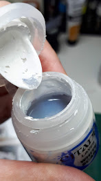
I generally use Scalecolour Artist tube paints, and I also use glaze medium (vallejo) and a satin medium (Kimera) to help remove the matte effect of the paints. That gold needs to shine!
The colours I use are:
Shadows - Black & Burnt Sienna Umber
Mid-tones - Yellow Ochre & Naples Yellow
Highlights - Vanilla White & White

Comments
Post a Comment