I'm hoping to do a series of tips, taken from the do's and don'ts blog I did a little while ago, with the aim of expanding further on them with an in depth look to help new and establish painters. Who knows, they might prove useful to you!
Getting to know your paints
So, you've just gone out and bought a tonne of paints and want to crack on with your painting. That's great, however... just a word of warning, that red you bought may not be the colour you thought it was. In fact, that red has purple in it and purple isn't what you wanted in your colour scheme.
It may seem like something you wouldn't need to consider but unless you are buying a primary colour, secondary, tertiary colours are made up of lots of other colours. Half the time to me, it just seems like an illusion to appease our eyesight.
Even black can be made up of brown or blue or purple, because those are their core mixtures. White as well, will usually have blue in it because that makes a brighter white (believe it or not), also white is not the brightest colour out there. It can in fact look very flat and desaturated. (I think that will be a future blog..)
I've gone through my collection of GW paints to give you an idea of what I'm talking about. It's something you may notice if you use a wet palette and leave your paints over night, only to come back in the morning and find they have separated into their constitute parts. You may have also not used a pot of paint for a while opened it and thought; this needs a good shake and that was it.
I haven't actually used my GW paints for a while as I have been working on my Isbiliya model for the last few weeks and have been using my ScaleColour Artist tube acrylics that don't need shaking (that makes me so happy...). So I went through my collection to find some good examples of paints that have separated.
White
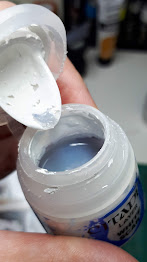


From left to right: White Scar, Pallid Wych Flesh, Ceremite White and Corax White.
You can see in all of these that the separated medium is a grey-blue colour, especially in the white scar and Ceremite White. And the Pallid and Corax is a much darker medium mix.
Grey
Wow, look at that light blue colour in the Ulthuan Grey! The Celestra Grey has a dark blue mixed into and you can really see that blue when set against a blue colour, it looks more blue than you realise.
Red
My personal favourite example. Mephiston Red and Wazadakka Red, you can see quite clearly both have purple in them.
Brown and Orange
Left to right: Rhinox Hide, Tuskor Fur and Squig Orange.
Rhinox Hide has orange in it, which would be red and yellow from the colour wheel, this makes it a good base for NMM gold. The Tuskor Fur has a very dark blue, almost black in it, it's a very reddy brown colour. And look at all that lovely yellow/green in the Squig Orange.
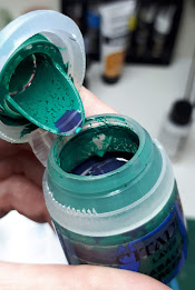
Greens
Although technically some of these colours are not green, you can see with them altogether how much along the green spectrum they actually are. Especially the two either end.
Left to right: Screaming Skull, Ogryn Camo, Kabalite Green and Zamesi Desert
Metallic Paint
This metallic paint is Brass Scorpion and you can see how very red and orange that is. It's a pretty saturated (strong) colour anyway and you can see why here.
Summary
Hopefully this is starting to make sense. When you start to learn what colours make up your paints, you can see whereabouts they sit on the colour wheel and from there figure out which paints will work with others. Eventually this will become second nature. If you paint often, your sight sense will start to become a pretty well tuned instrument, just like a chef or wine taster eventually can pick out the subtleties in the food or wine they prepare/taste, you will be able to see the kaleidoscope of colours in a dense forest or a grey sky.
So, next time you go to open a bottle of paint just take a look closely at the contents before giving it a good shake. Not every purple, red, grey or blue (etc) are made up from the same colours and often getting to know where they sit on the colour wheel and the tonalities they are made up of and if they are warm or cold, will help you create colours schemes that will be admired by your fellow painters.
I hope you found this helpful, if you have any questions let me know, I'm always happy to help where I can.
Disclaimer
All opinions are my own, from my own experiences and steep learning curve I have been on. Don't forget we are all different and have our own views and perspectives. Play nice!


Comments
Post a Comment